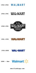
Since its humble beginnings in 1945, Walmart has grown to become the world’s largest supermarket company. The brand is now known for selling everything from clothes and furniture to food and electronics at low prices. Over time, their logo evolved through several iterations as they sought a more compelling representation of who they are today.
“There is only one boss. The customer. And he can fire everybody in the company from the chairman on down, simply by spending his money somewhere else.” Sam Walton, Walmart Founder
Walmart uses a logo with an image that looks like it could be either a sun, star, or flower. The brand name is written in blue letters on the left side of the yellow design and there are six thin dashes going outwards away from each other around the thicker end inward creating this shape resembling these three different things at first glance just by looking at how they’re arranged.
The casual design of the Walmart logo makes it fit for appearing on everything from giant billboards to small product labels. It may help customers forget that Walmart is a huge corporation while still looking responsible and trustworthy enough to attract long-time shoppers.
“Outstanding leaders go out of their way to boost the self-esteem of their personnel. If people believe in themselves, it’s amazing what they can accomplish.” Sam Walton, Walmart Founder
Walmart has decided to change its company philosophy and a new color scheme is in place. The combination of blue and yellow now represents friendliness, hope, best quality products, as well as achievement of the highest product quality level.


